So here’s the thing about flat UI: The year 2020 has taken a strange turn and the general trend of UI design has moved towards curvy corners and glossy gradients. Well, though I don’t keep any specific grudges against UI’s that look like cotton candy, I am forever drawn towards extremely flat UI.
Who is the flattest of them all?
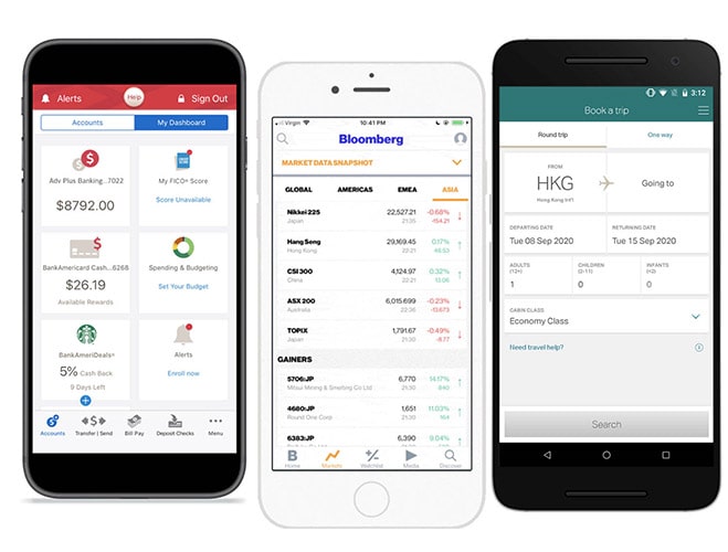 Screenshots of various mobile apps and their flat UI design Bank of America, Bloomberg and Cathay Pacific
Look at some examples of user interfaces above. Bank of America, Bloomberg, Cathay Pacific — they’re not flat just because some fancypants in the design team decided they needed to look that way. These are immensely big companies and they almost always hire top-notch talents out there. This is a well researched, well planned, and very very deliberate attempt to strip the UI of all the Dribbble-y flairs and put content first. Thus the flat UI.
I love these UI’s. This kind of UI designs are my favorite. I was thinking about this earlier how this has influenced my work. Recently, Saroj mentioned that he could almost see a pattern in my work — no shadows, no rounded corners, no “container” borders. And he is right, yes, I intentionally avoid decorations.
A Figma component library
 I built a 26 screen app but just using these many components.
I am by nature a lazy person. I hate maintaining complex components in Figma (or any other tool I use). So I tend to keep it awfully simple. Just 8-10 Figma components and their permutations are enough for me to run a large scale design project. By the grace of god, this has worked for me so far. As a result, my UI’s are easy to scale, amend or variate. Recently, I had to white label an app I designed. For this, I simply changed the primary colors from the “Colors” library and changed the font family and voila! It was an entirely new app altogether.
I was able to do this because how flat my design was. The structure was flat, the component hierarchy was flat and the colors were flat: just a primary and a secondary color and 5 other scales of gray.
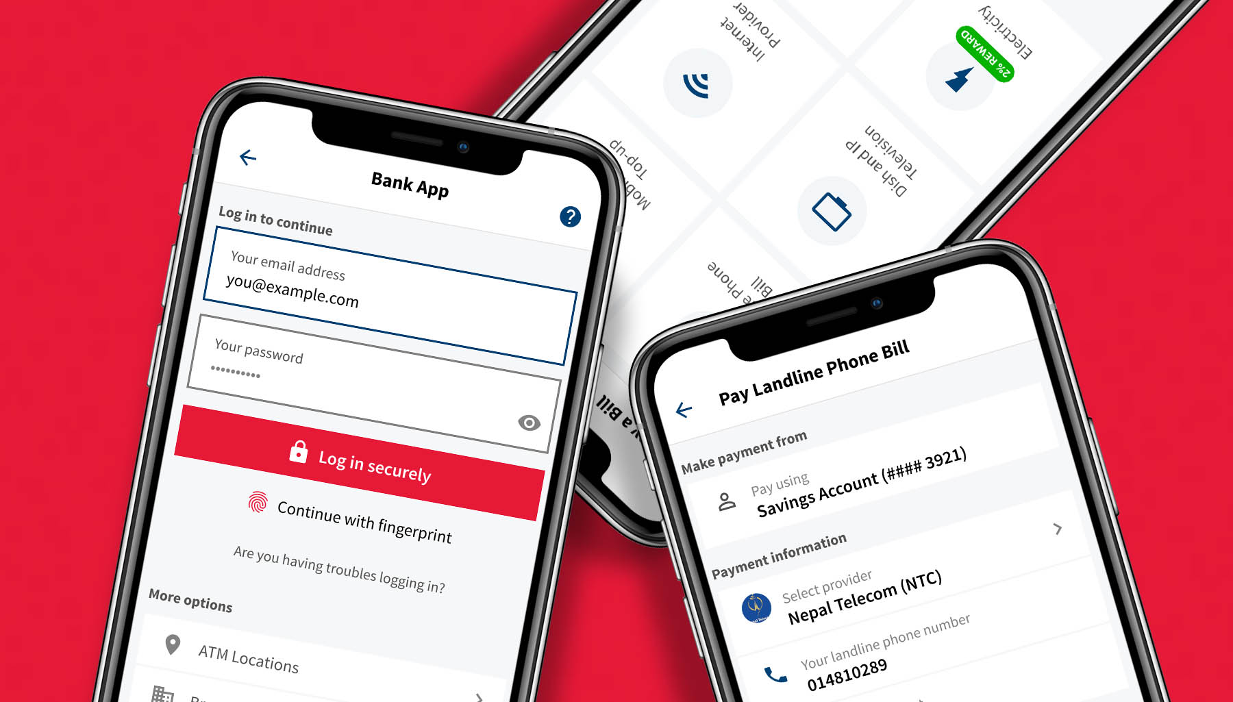
Flat UI puts content before visuals
Flat UI is not just a visual style, it is how content is structured and how interactions are derived. It’s much more than just how the UI looks on the outside.
The core objective of designing something flat is so that the content takes the center stage and everything else becomes less important. Your borders, background colors, gradients, everything else simply become an ornamentation and do not really contribute anything to the main story. Imagine them being supporting characters in a movie — whereas our “hero” is the information we present.
What happens when there is too much ornamentation?
“Design” is a painfully misunderstood term where most people perceive design to be the intricate needlework somebody has done. Unfortunately, intricate detail is the enemy of simplicity. When your ornaments empower the content, your message is lost between the fancy things you intend to do. It’s as simple as that! For example, I looooove the Cathay Pacific website and its mobile app. There is a good reason I prefer this over Malaysia Airlines. Look at the two side by side:
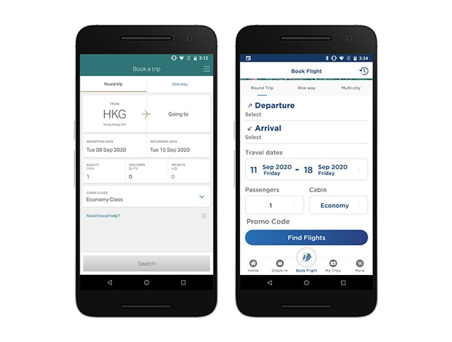 Side-by-side comparison of flight booking screen of Cathay Pacific and Malaysia Airlines. Notice the “flatness” in content structure and design, while Malaysia users ornamentation and on-your-face typography.
While Malaysia Airlines uses a lot of “style” to stylize their web components, see how flat Cathay is. They don’t even care show you a visual of your destination. Why do they do this? Because they want to get the most done out of their user’s time and effort. The reason why the Cathay’s app works for me because I know exactly where to look for for a specific information; and it tells me exactly where I am and where I need to go next (payment, seat selection, etc.) This really helps users to navigate as quickly as efficiently as possible and get to the payment page.
Moral of the story: flat design = profits! 💸💸
- A gentle disclaimer that I in no way am saying the MAS app is bad. It’s good for the brand is consistently carries across its collaterals. The comparison I’m making is simply based on how Cathay positions itself. Peace. ✌️✌️ *
But why do Dribbble designers use so much ornamentation?
 For fuck’s sake please explain to me how am I supposed to perceive these items popping off the mobile screen?
Dribbble is a place to show off (Sorry, Zack!). It’s like that fancy-dress party where everyone dresses to impress. Everyone is showing off their expensive high heel shoes there. Anyone who has worn high heels and stood at a party for 4 hours will know the pain of wearing one. I haven’t, but I’m empathetic. A high heel isn’t necessarily usable or functional for most of the bits than just showing off. That’s what designers do all the time at Dribbble.
So the “trend” that they establish is simply a fad. See how fads come and go. Remember the neomorphic UI design? That wasn’t even a year ago and now it’s virtually dead. Why? Because it looked sexy, but it wasn’t functional. That’s the problem with cotton-candy UI’s. They come and go, but because they provide very little functional value, they become obsolete too quickly.
Don’t worry – content is here to stay. Focus on the content.
If you continue to focus on the information you’re displaying through your UI, things will never go wrong. When you decide to use a stark color to indicate that this “region” is a button, and that “region” is a list item, users will continue to benefit out of it. I will not say that I have never designed fancy-ass UI’s. Yes, I have. But what I’ve also learned is it doesn’t matter. It made me excited that I did it, but the clients didn’t give a flying fuck. They don’t care — they want their content to be legible and functional. That’s all they care.
In the last few years, I’ve worked with so many clients who have absolutely no preference on UI because they focus entirely on the content. They care what shows up on their screen and we tend to help them achieve that. To them, fancy UI sometimes is an impediment. It hinders their user’s experiences when things are too flashy.
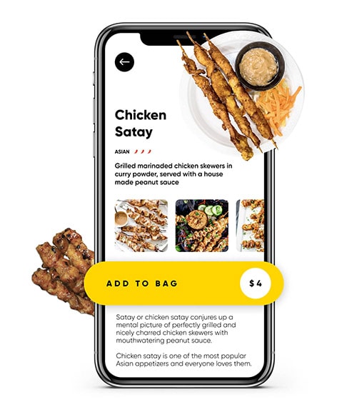
For example, once a thick-ass, red-and-orange gradient button 120 pixels high ate up almost 25% of the real-estate on smaller mobile phones, and this was a problem. There were more important things that screen that needed to be shown to the user before they decide to click that button. Now that button became an instant eyesore; it hindered users’ ability to perceive and process rest of the information shown on that page. It seemed as if we were tempting the users to click that button (which we were not) and as a result, users felt they were unable to understand the info we were trying to show them.
Net, net: If you’re adequately lazy as I am, you will end up creating a very simple design framework and will spend less time “decorating” your designs. This way, you will have more time to complete the UI on time and your users will do their stuff quicker and everybody finishes everything on time and goes home.
And kids, that’s how you achieve world peace.