
Designing a wireframe, or a mockup, has forever been an insanely misunderstood term. Designing is not about putting pretty pixels together. I’ve said this time and again in my previous blog and social media. Designing (a UI or a wireframe specifically) is about putting meaningful pieces of information together so it all makes sense.
Many designers jump into building wireframes (or let’s call them the skeletons of final design) as the stepping stone of a project. While it’s a good idea to start envisioning things from early on, oftentimes poorly envisioned skeletons end up becoming dreadful setbacks, and start haunting the designers. Boo!! 💀
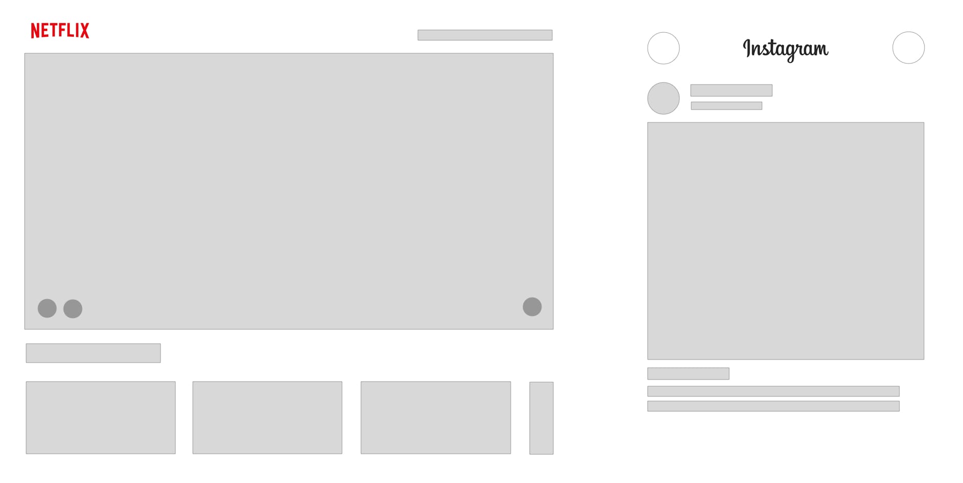 Netflix and Instagram’s skeletons
These are two low-fidelity (lo-fi) wireframe of Netflix and Instagram. Apart from a few gray boxes, there isn’t too much happening here — that is without the content that fills up these boxes. They’re dull, meaningless and vacant boxes that neither provide context, nor add any value to the overall design. Perhaps it does give some direction on the layout and where the buttons are going to be and all that — but trust me, the position of the buttons are one of the least concerns for us during the product discovery phase.
Content gives context
I presented a webinar few weeks ago where I discussed with my participants an example that showed how useless a UI is with dummy content. Without the relevant pieces of information that gel together to make the UI meaningful, a wireframe is just a layout plan. A lot of people talk about design, and hope to fill it up with “real” content later, but that is the worst way to approach UI design. It seriously doesn’t work, and there are chances you will go round and round in circle wasting time and effort. Why? Because you’re just telling your audience what the UI looks like; but fail to answer the question “What it does.”
A wireframe UI needs to do something
Every UI screen is out there because there is an action to perform, a piece of information to consume or something; just something needs to happen. If a UI is there but nothing is happening, there is a problem. That’s the exact kind of problem that occurs when the content of the UI is not thought through properly, or the designer has played lazy to fill up the space with some Lorem Ipsum or some wireframe boxes – and there you have it: a UI that doesn’t quite tell what the user is supposed to do.
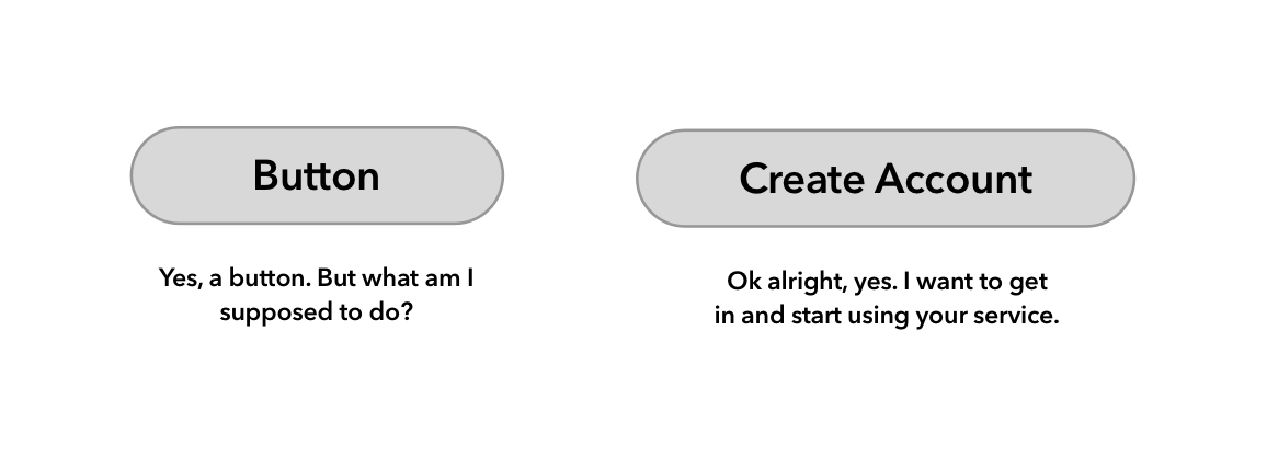 Labeled versus unlabeled buttons
Buttons in UI needs to command an action. Every button must tell what will happen if it is clicked. Is your user going to create a new account, make a payment, or find hot singles in their area: a button needs to be explicit. If you use generic “Lorem Ipsum” as your button text, it will be hard to imagine, as a person looking at your wireframes to understand the action, and the steps following it. Don’t use generic text.
Let your audience know what they’re looking at
I will share an interesting story from 2014-ish. Back in the days, I was lazy. I did not have enough knowledge, or energy to look for realistic content while designing the UI. So what I did was this was one of healthcare dashboards I was designing which showed specific stages and statuses of patient insurance amounts. In the first pass, I filled up the UI with gibberish text and buttons that just said “Button” and sent it off the the client. (Side note: this was pre-Invision and Figma era; we received feedback in Word document)
I was baffled by the comments received. The low-tech client was unable to comprehend what they were looking at. The dashboard, which looked pretty awesome to us was returned stating that they didn’t get it. Well, now I look back and evaluate — I know exactly why it did not make sense:
- Each claim status (paid, pending, withheld, etc.) had a corresponding status attached to it. Our said UI provided no relationship between the status and the action.
- While creating a user flow, it is important to pick a character (like the hero of your story, let’s say John Doe) and show their progression in the story. Imagine a typical 90’s era film where a hero meets a girl, falls in love, the villain abducts the girl and the hero fights to get her back — a UI should be able to show that end-to-end narrative of your story. Imagine John Doe first logs in, sees few chargeback notifications, clicks and opens a patient details (say Jill ClientLady), matches the hospital invoice details, matches claims records and when he thinks it all looks good, he marks a transaction as complete. That would be a complete narration a wireframe must be able to provide; ours didn’t.
- Low-tech clients need help understanding the difference between a lo-fi, a hi-fi and a working prototype. Many of the times, top feedback we receive is that they were not able to type in their username and password into the wireframes. We failed to provide that education before sending off our shiny new wireframes.
Imagine UI as plate and utensils, not the food
A UI is simply put, a plate that will hold the food for you. Your fork and knife are controls (eg. buttons, dropdowns, etc.) and the content is the food. You’re going to eat the food, and not the plate or the fork. Mark that distinction well. Things will be much easier to process for you and your users that way. Your food could come from a variety of sources, the users can bring their own lunch bag and pour it into the plate, or you could serve them what you’ve cooked. Eating is their action. Make sure if you serve a steak to include knives, and a soup spoon if you have served something brothy. Controls will vary upon the type of content — make sure about it.
Going back to the Netflix and Instagram wireframe: what makes these two services so great? It’s not the wireframe, because honestly, there is hardly any design innovation on the catalog page of Netflix. Look closely, they’re just a bunch of thumbnails – yet Netflix has 60 million people looking at this page every month. Why? The answer is simple, the content (in this case, the rich selection of film titles, or the AI recommendation engine that tells you what to watch) is what makes Netflix’s design so great, and so successful. Same with Instagram, those images that fill up the large square box on your mobile phone screen engages you, captivates you and hooks you — and that’s how Instagram makes money: out out that bland square box, which without content has absolutely zero value.
The wireframe litmus test
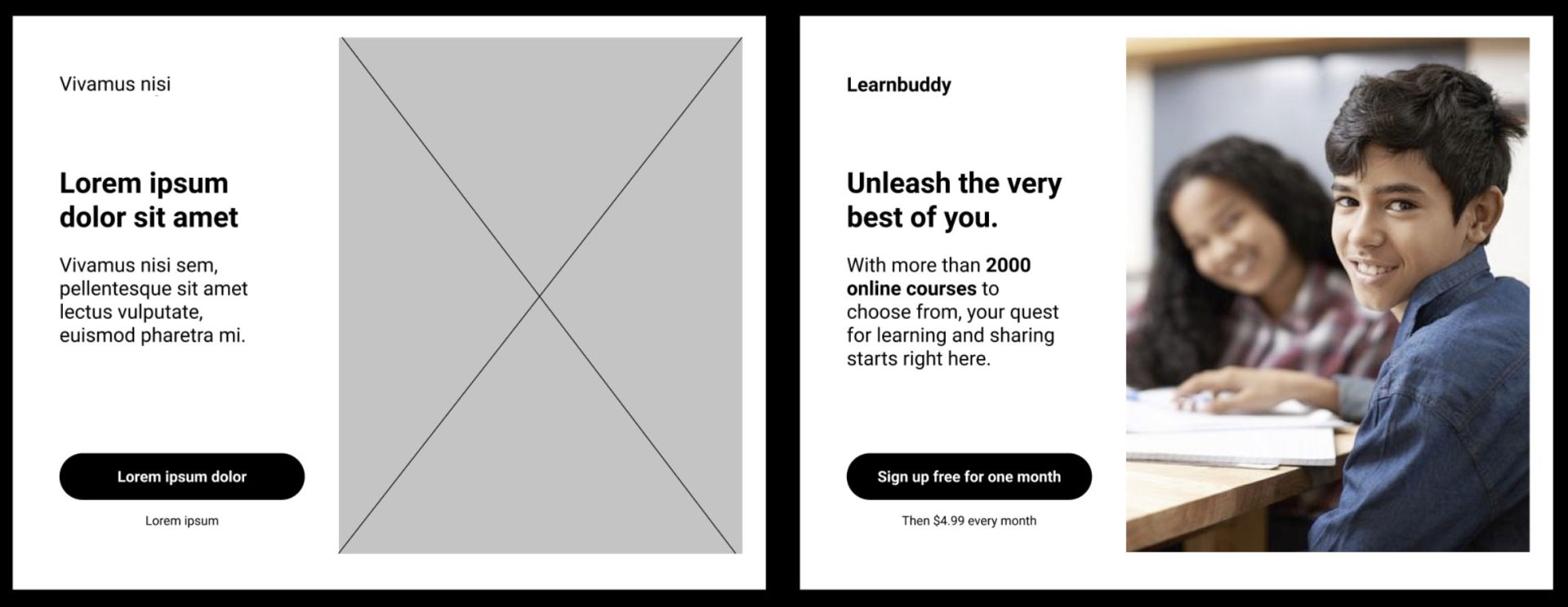 Wireframe comparison
Let’s look at these two images. The left one is the generic, now infamous Lorem ipsum type UI. What we’re trying to design here is a hero panel for the landing page of a group study thing. The main pieces here are the fact that it’s an online course for groups, it costs money to join and it is for young learners. The left side of the image provides absolutely no context so it is hard to set expectations as a user. The right side image has a nice-looking boy whom you can trust asking for help, it clearly says it costs money every month and it has a large catalog of more than 2000 courses. It sets the mood and tone correctly for what to expect.
As soon as a user sees the screen on the right, they know what they’re looking at. You can measure their response because you’ve provided them with enough data to base their judgment on. Getting feedback becomes easier and now you don’t need to wonder what could be going on in their heads. See? Like a breeze!
I cannot stress this enough: Please. Provide. Context.
While it may make perfect sense to doodle out some lo-fi concepts before venturing out into building the real thing. In fact, I urge you to do so — trying to build something with absolutely no content or context is what I’m arguing would become counter-productive.
In the last couple of years, before I jump into making a wireframe, I spend a good amount of time trying to populate my design with realistic, if not real content. It’s important that the looker knows what they’re looking at. Also, there is no guarantee that I will have the exact accurate real content all the time, for this I tend to use realistic data. For people names and other things, I use Figma’s Content Reel plug-in. It gives me names, address and telephone numbers, among other things that look realistic. For website and landing pages, I make my best guess. Yes, the client can always come back and provide you with better copy, but guesswork is good enough to get started with.
When you’re working with realistic content, your designs will automatically start to speak volumes and everything will start making a lot of sense. This, I speak from experience. You can choose to use a lo-fi or a hi-fi mockup design — with your wireframe, you’re not really showing your layout prowess. We know you’re capable of making cool layouts, but we really want to know what the story is.
Trust me, a UI with an appealing story is already a 1000x UI.